Wednesday, March 21st 2012
After work today we caught a bus to King’s Cross to take a look at the new station that has just opened.

The pointing finger…
…shows the way
At the station, the old entrances are now exit only and there were teams of people redirecting approaching customers to the new way in. A large poster of a hand points the way.

A first glimpse
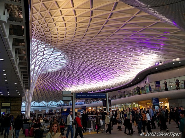
The roof dominates
As soon as you enter, you are struck by the ceiling whose pattern draws the eye. They have decided to make a feature of it by illuminating it with coloured lighting.


The roof is supported by steel trees
A main tree and peripheral ones
To keep the central area as clear as possible, the roof is supported on a system of metal trees. There is a main tree (see image on the right) and subsidiary ones around the periphery.

Departure boards…
…and the usual amenities
Around the open area there are shops and cafes and the inevitable departure boards. To watch these, there seems to be standing room only…

The outer circle
There’s an entrance the the Underground
Around the central space is a circular corridor with doors to the outside. It is quieter here (or was when we visited it) and there is an entrance to the Underground.

A retail sector
Shops, featuring the usual suspects
Here, too, there are shops, with the usual suspects (the common high street names) featuring in an environment that reminds me of the similar section in St Pancras station.

The ticket office
Bigger than the old one but is it big enough?
The new ticket office is much larger than the old one, its size emphasised by the small number of customers present. Let’s hope it still proves to be big enough when trade picks up.

A long view
The ceiling is too long to capture in its entirety
The shape and extent of the ceiling make it impossible to capture in its entirety with an ordinary lens. It would need a fish-eye or a panoramic lens. This angle catches a fair amount of it and shows the balcony or gallery that runs around the whole area providing access to pubs and eateries.

The Old Parcel Yard
Now a rather nice pub
At the end of the open area, a staircase leads up to an old administrative building where parcels were once handled. The property has been converted into a pub called The Parcel Yard. We went in to try it out and were suitably impressed. The atmosphere is relaxed and even though I ordered and paid for coffee at the bar, the barman insisted on bringing the coffee to the table.

Pub interior
An eclectic collection of furniture adds interest
The decor is a mixture of modern (exposed wiring and pipework) and faux-antique (recycled machinery, old cinema seats and dark wood). The fittings are of good quality (I am obviously talking about the loos here!) and the staff polite and friendly. The only small fault was that they do not provide free WiFi but, then, perhaps they don’t want people hanging about all day over half a pint of bitter..

A view from the stairs
Showing part of the gallery
The last photo I took was this view from the stairs in front of the pub. It shows part of the walkway or gallery that runs around the main part of the building.
It remains to be seen how people will take to the new building and how well it will function under the pressure of daily routine. So far, the signs are good.
Copyright © 2012 SilverTiger, https://tigergrowl.wordpress.com, All rights reserved.


Wow, the ceiling design is absolutely amazing!
LikeLike
Very striking.
LikeLike
The concept of the ceiling, and indeed your mentioning of trees, calls Gaudí to mind. He reproduced nature’s solutions to load-bearing in his magnificent early 20th-century architecture. See:
http://www.google.co.uk/search?tbm=isch&hl=en&source=hp&biw=1280&bih=685&q=sagrada+familia+interior&gbv=2&oq=sagrada+&aq=1&aqi=g10&aql=&gs_sm=1&gs_upl=1684l5481l0l8578l9l9l0l1l1l0l126l922l0.8l8l0&gs_l=img.1.1.0l10.1684l5481l0l8578l9l9l0l1l1l0l126l922l0j8l8l0.frgbld.
Also, I think it recalls Victorian railway station architecture – impressive and functional. I’m sure that the architects of this new station could have saved money and produced yet another boring, ugly concrete monstrosity. Top marks to them!
LikeLike
The comparison with Gaudi is interesting – I hadn’t thought of it.
The architects have done something spectacular with the space available. The old part now has to be refurbished so it will be a while before we know how well it all works together.
LikeLike
Definitely agree with what you’ve said. Lovely space….hope the transition to the other part is done carefully and also with grace and style
LikeLike
It looks lovely. The design seems to make sense in terms of use of space. I do like the colored lights on that rather impressive ceiling.
LikeLike
I agree with both points. The “tree” supports leave the centre free and the lights add colour.
LikeLike
I’m impressed, both by the design and your photography.
LikeLike
Thanks for the compliment 🙂 I’m lucky to have a good camera.
LikeLike